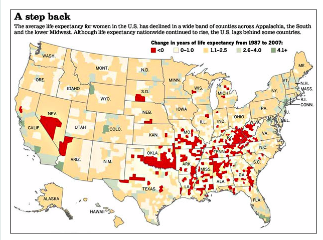
Some counties in the U.S. (the red ones) saw declines in female life expectancy. Perhaps due to rises in inequality here in the land of the free.
Hat tip: BA
Hat tip: BA
| Big Ideas |
|
Some counties in the U.S. (the red ones) saw declines in female life expectancy. Perhaps due to rises in inequality here in the land of the free.
Hat tip: BA
2 Comments
CBT
7/6/2011 10:28:29 pm
Fascinating picture! Without reading the article, my first though is what about self selected migration of the healthy? Or not even the healthy, but rather those with the ability to pay for better medical care...or, gulp, insurance? At least the counties in Michigan appear to be counties with high levels of out migration, but I don't know if that story would hold in the south.
Aine
7/7/2011 04:23:36 am
Yeah, these are really good questions. It would be interesting to compare this map to one showing emigration by county over the same time period. Also, CBTheo, are you totally not surprised by these results?: Leave a Reply. | Aine Seitz McCarthy
International development, economics and some pretty ambitious ideas from a stubborn graduate student clinging to her sense of adventure. CategoriesAll |
 RSS Feed